Crust & Crumble Rebrand
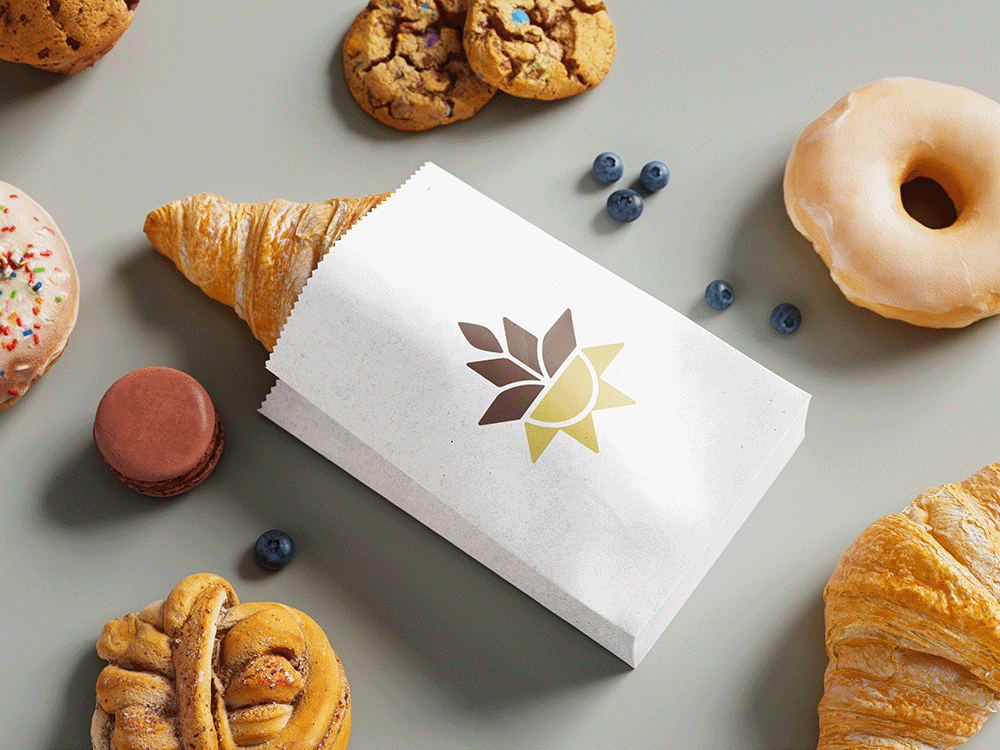
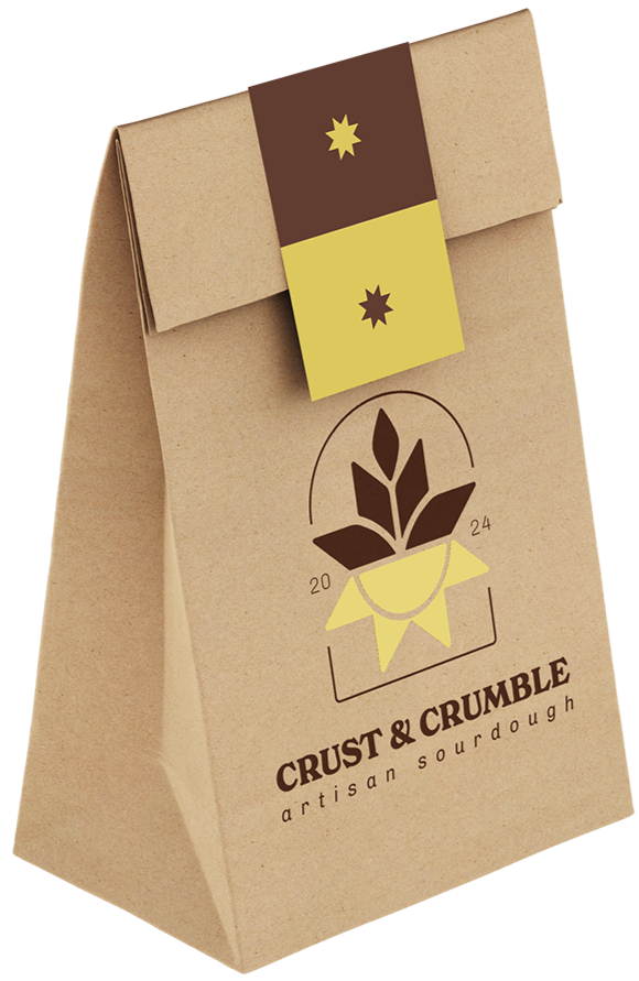
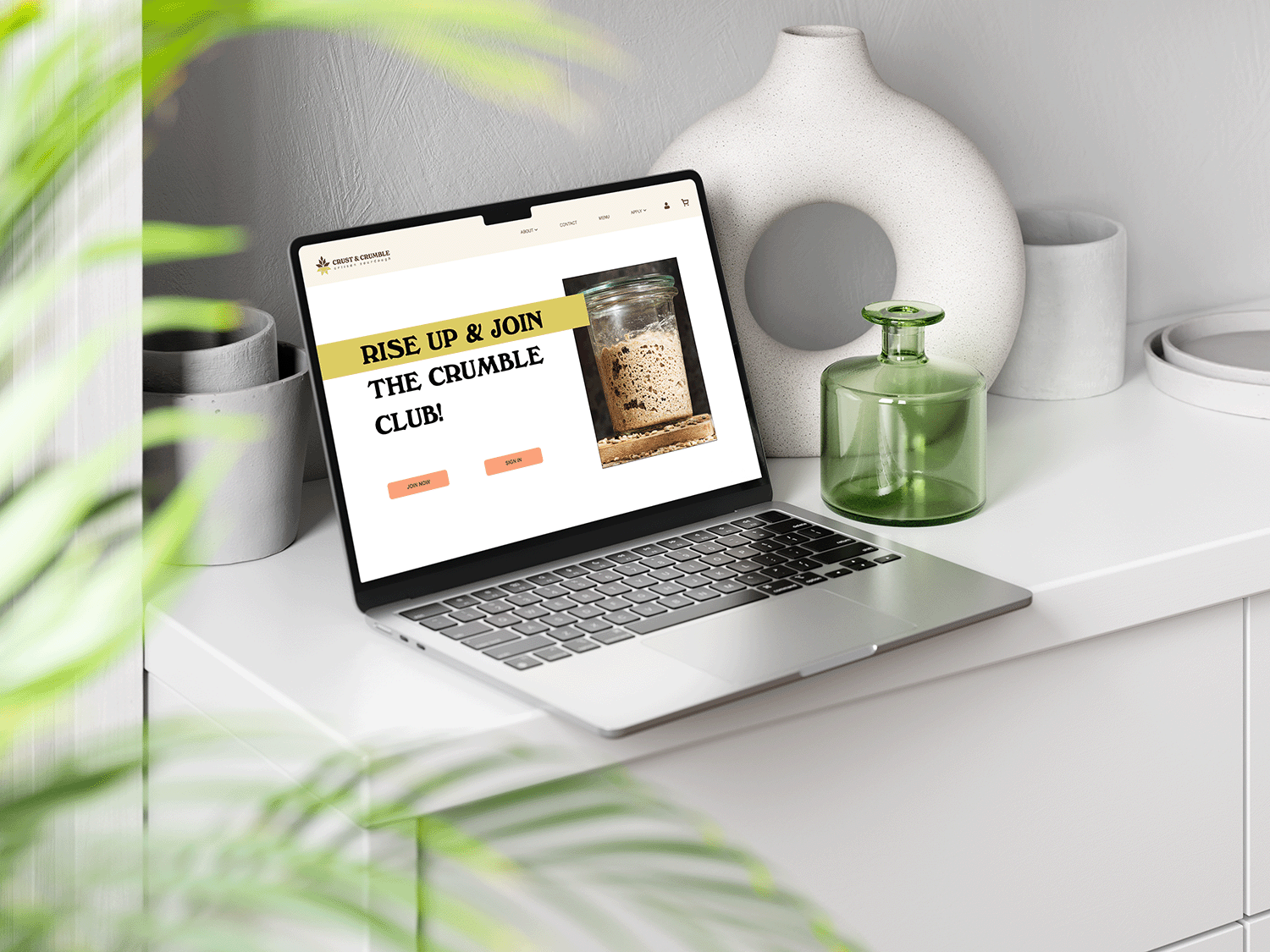
Crust & Crumble is a concept bakery specializing in sourdough baked goods. The old logo was created by me as a class project. I updated the Brand Identity to give it new life and to more accurately represent the brand’s desired image. Key brand words include: Wheat, Sun, Light, Warmth, Organic, & Airy.
TOOLS USED
Adobe Photoshop & Illustrator
ROLE
Designer
YEAR
2025
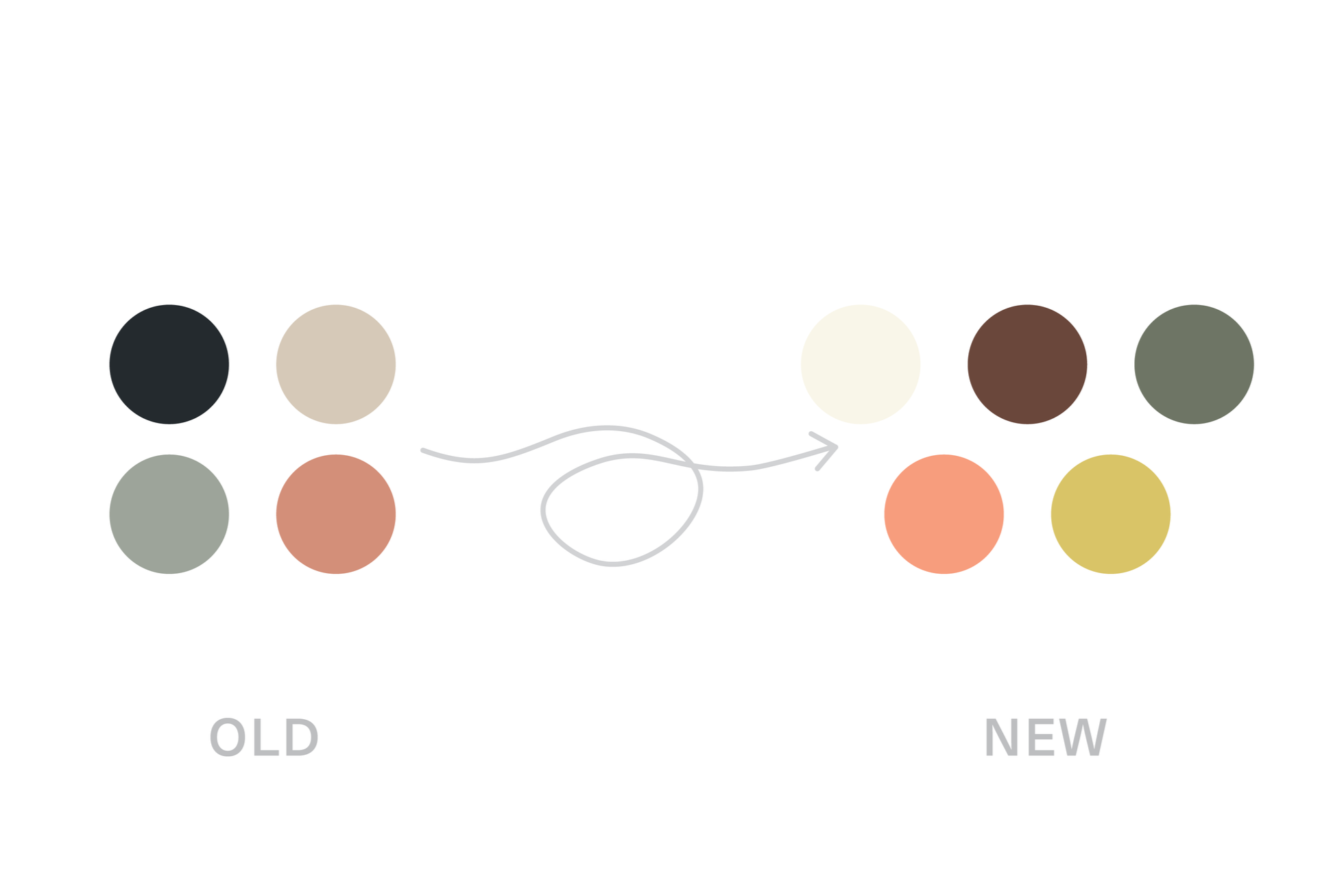
The Old
The heavy color palette feels too dark for the brand. Fine linework and small text reduce readability, scalability, and overall versatility.
The New
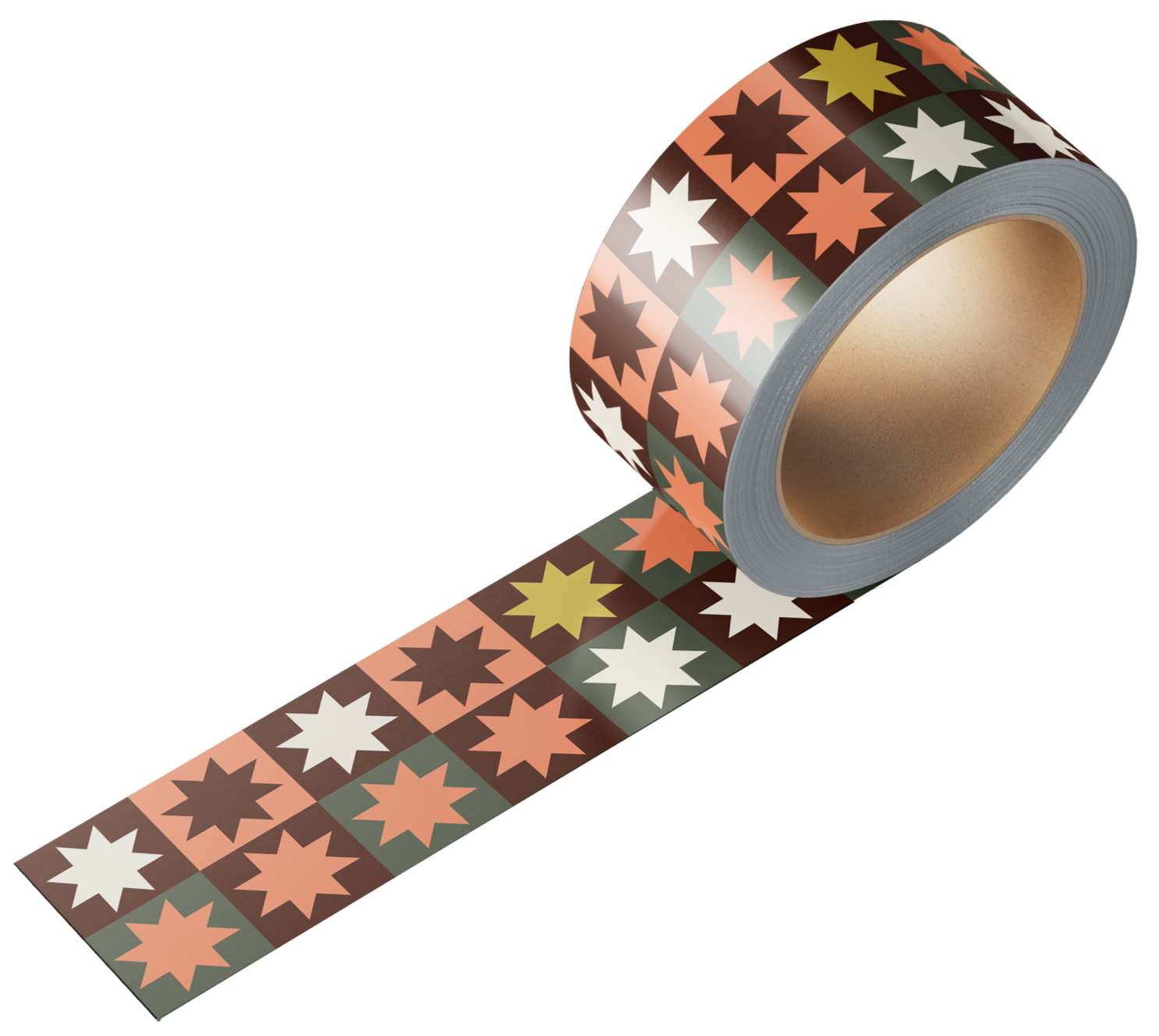
A simplified brand mark integrating wheat and sun motifs for a warm, organic feel, with a star shape from the quilt pattern adding cohesion. Designed to work seamlessly in both full color and one-color applications.
Style Guide
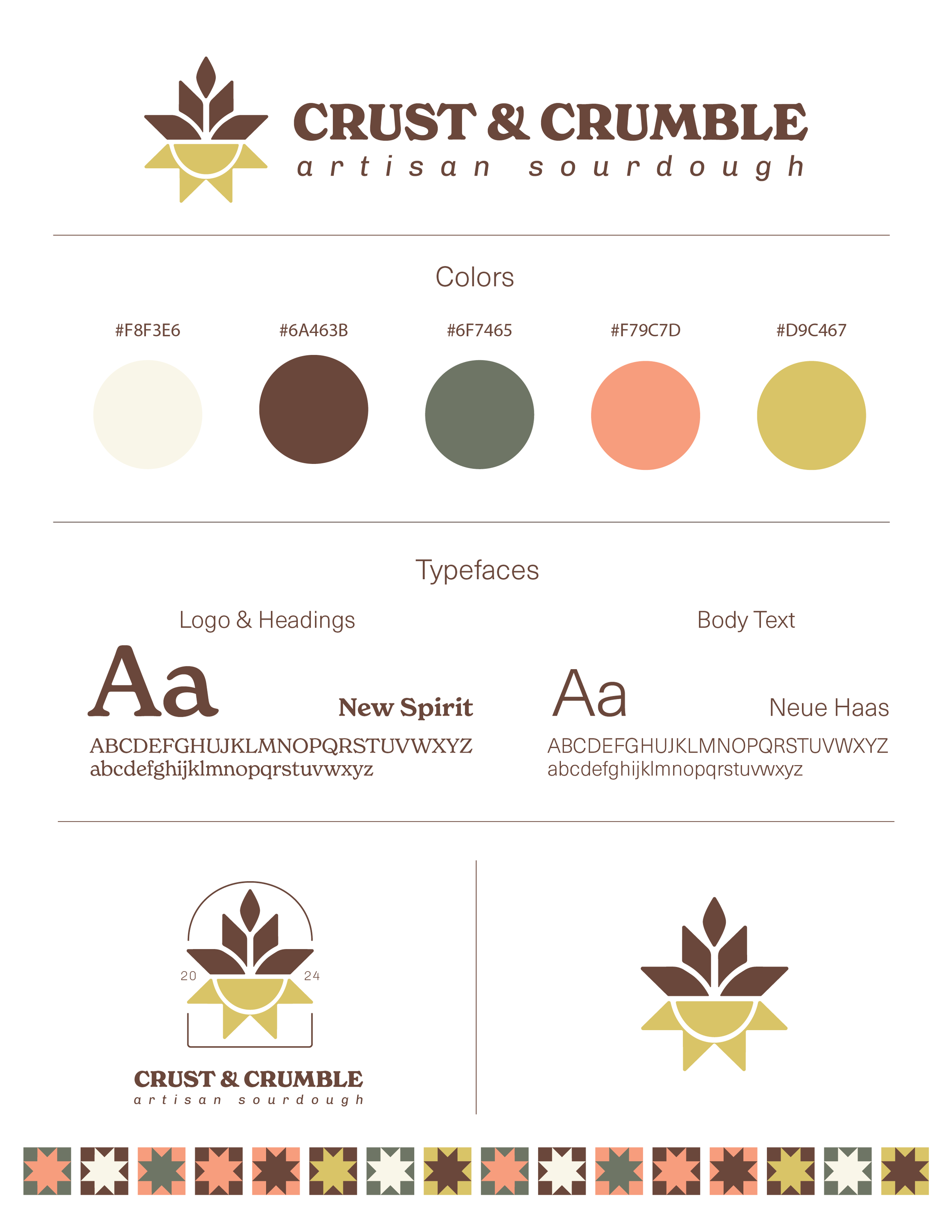


The refreshed color palette uses warmer tones to achieve an organic feel: black was replaced with brown to represent wheat, and yellow was added to represent the sun and warmth.