Crust & Crumble
PROJECT TYPE
Brand Identity Rebrand
TOOLS USED
Adobe Photoshop & lIlustrator
ROLE
Designer
YEAR
2025
Crust & Crumble is a fictional bakery specializing in sourdough baked goods. The old logo was created by me as a class project. This year I updated the Brand Identity to give it new life and to more accurately represent the brand’s desired image. Key brand words include: Wheat, Sun, Light, Warmth, Organic, & Airy.
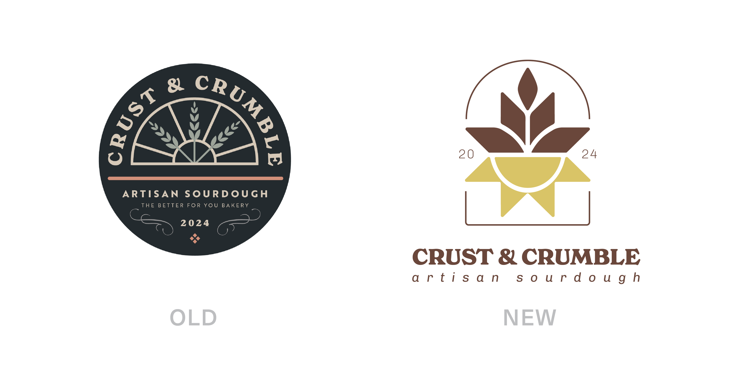
The Old
What’s working:
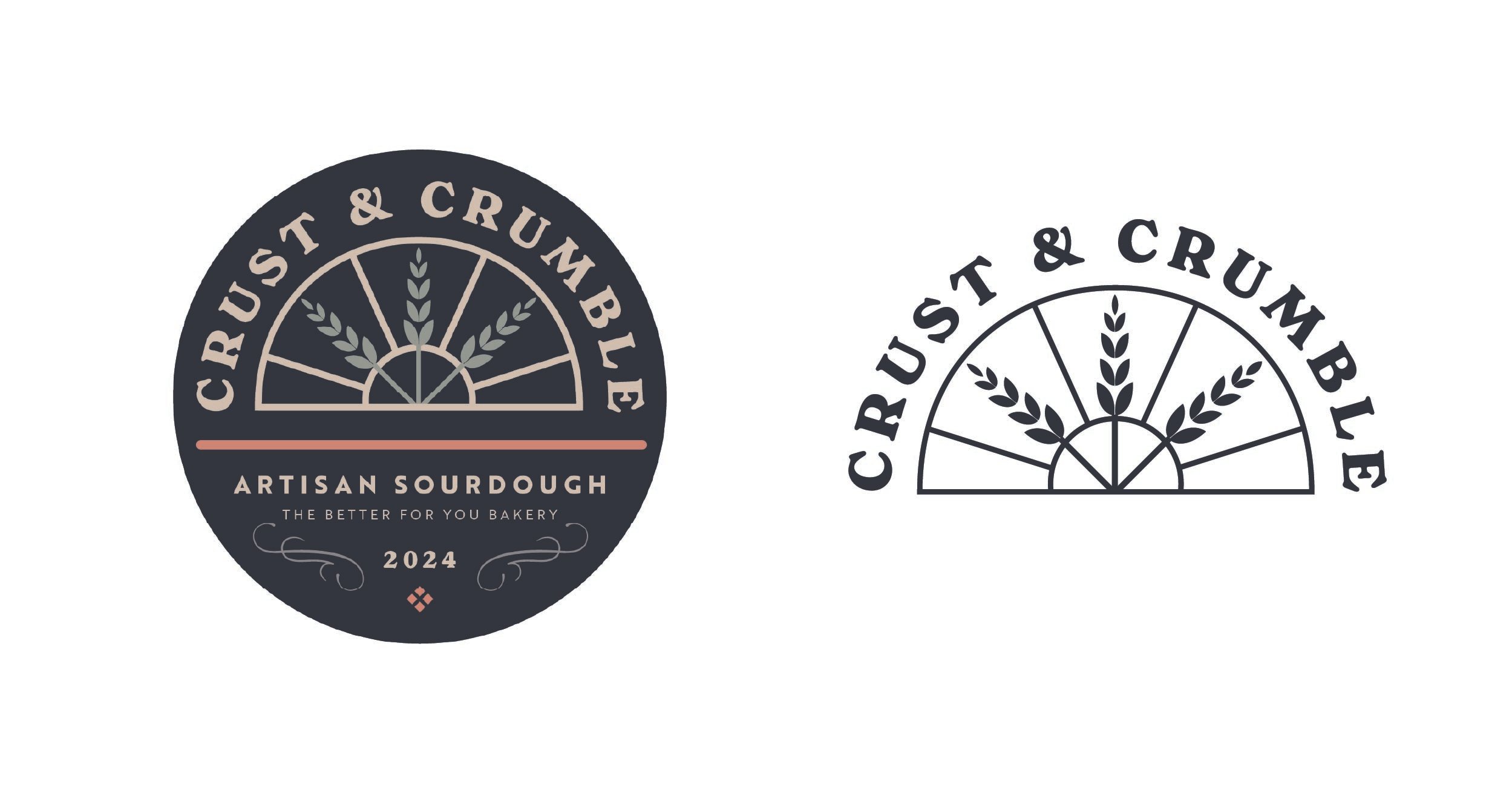
Use of wheat & sun rays that mimic a stained glass window.
The brand mark can be used as a one-color logo.
Round shape works well for stickers & branding.
What’s not working:
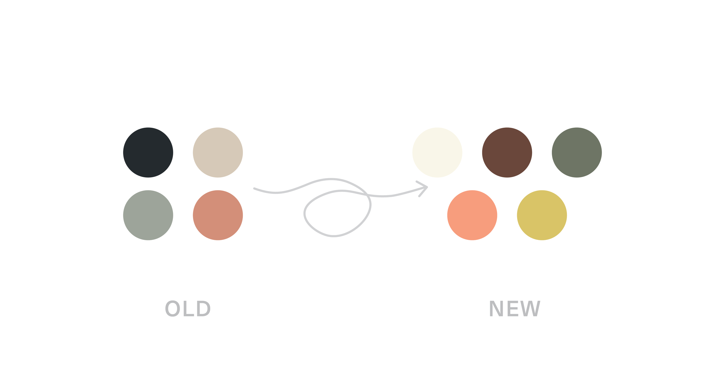
The black was too dark, and didn’t portray the airy, organic feeling of the brand.
The bottom text was too small.
The wispy lines do not scale well.
The New
The changes:
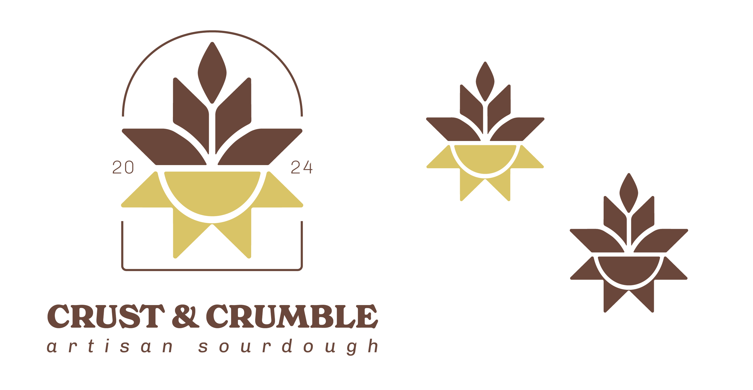
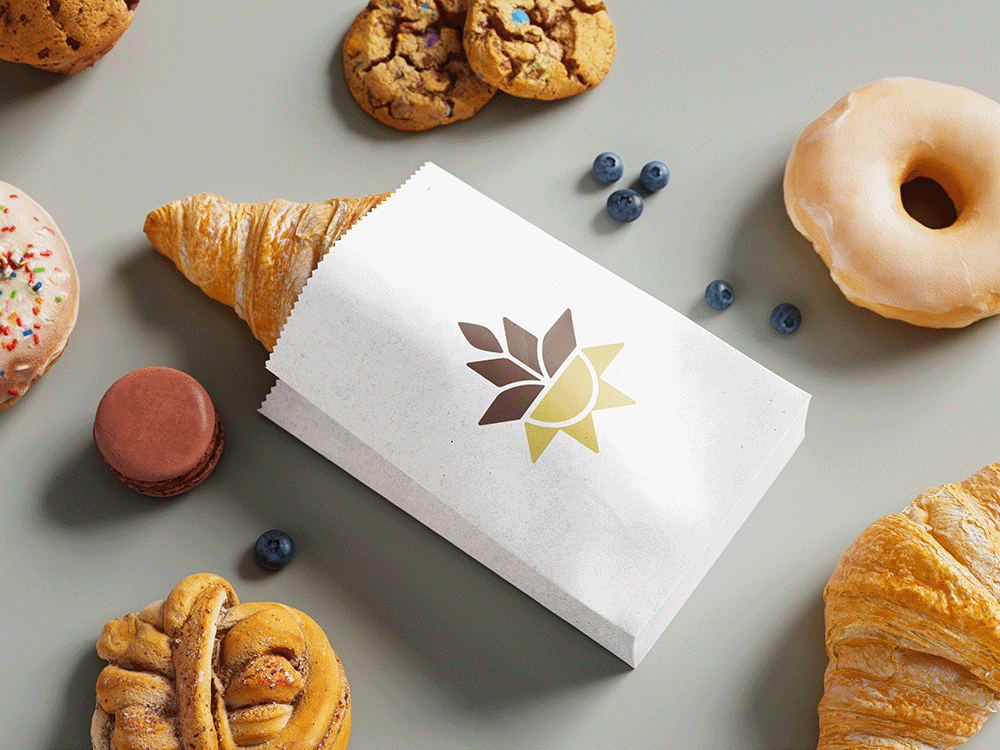
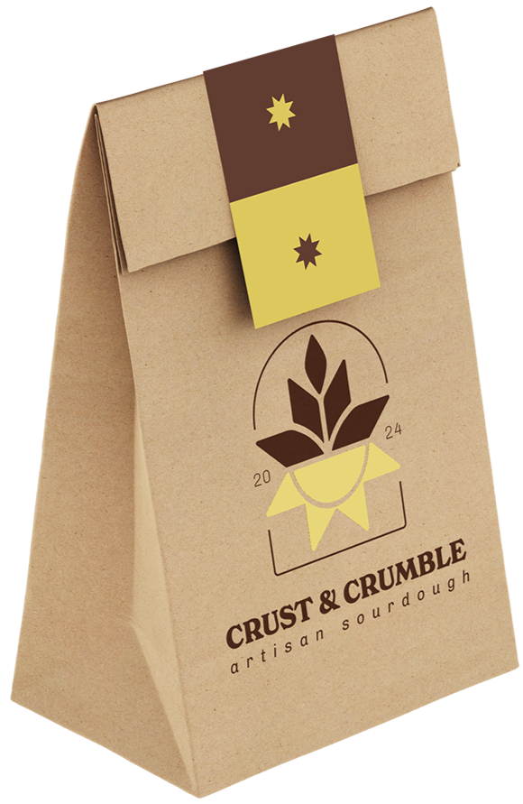
Simplified the brand mark while incorporating the brand’s nouns.
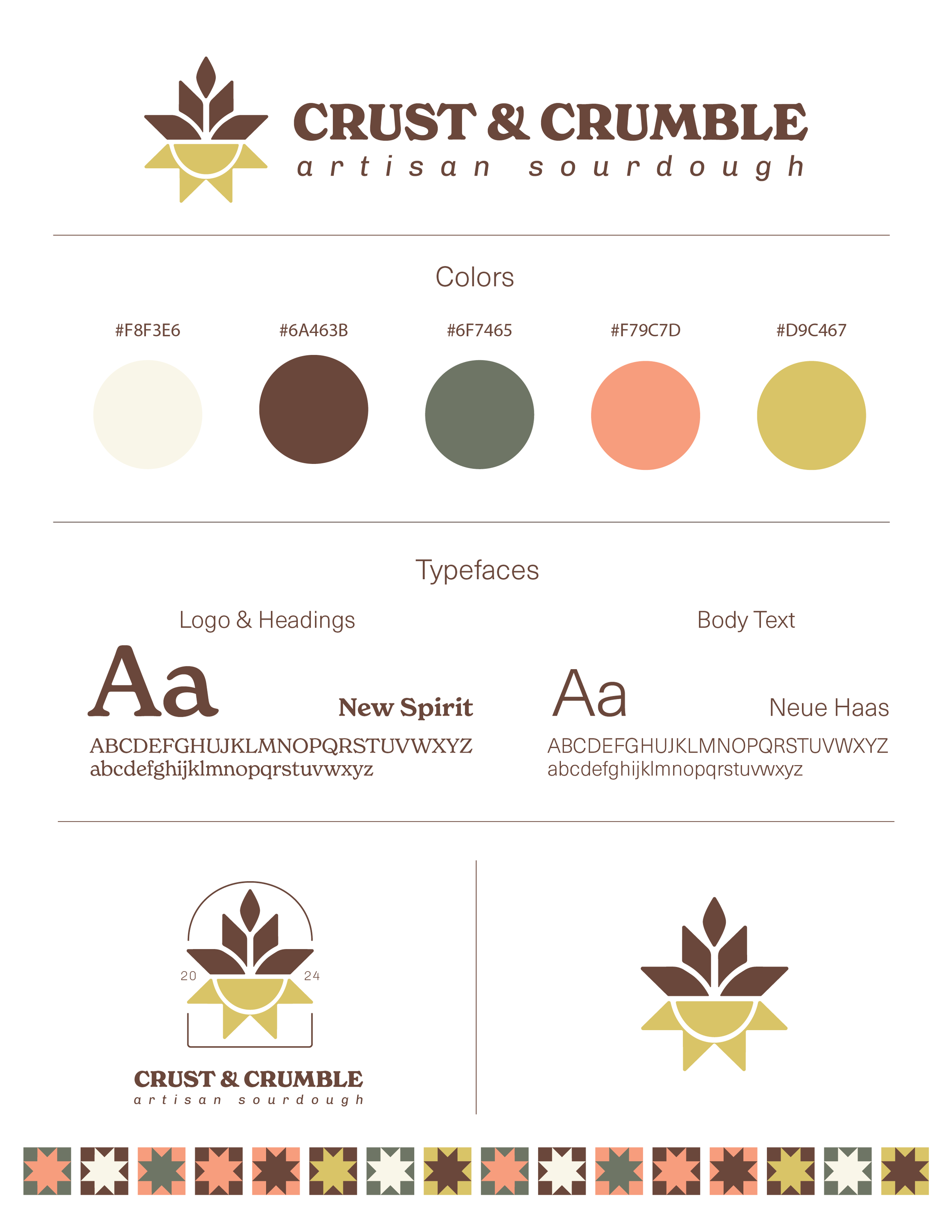
Wheat and sun are thoughtfully integrated and the warmer colors convey a light & organic tone.
The star shape is taken from the quilt pattern created for the brand, which gives an overall unity.
Brand mark still works well isolated and as a one-color mark.
The lines around the full logo mimic a stained glass window.


